I have a new favorite conference called edUI! I attended it few weeks ago in Charlottesville, VA. Following are some highlights from it, including resources for you:

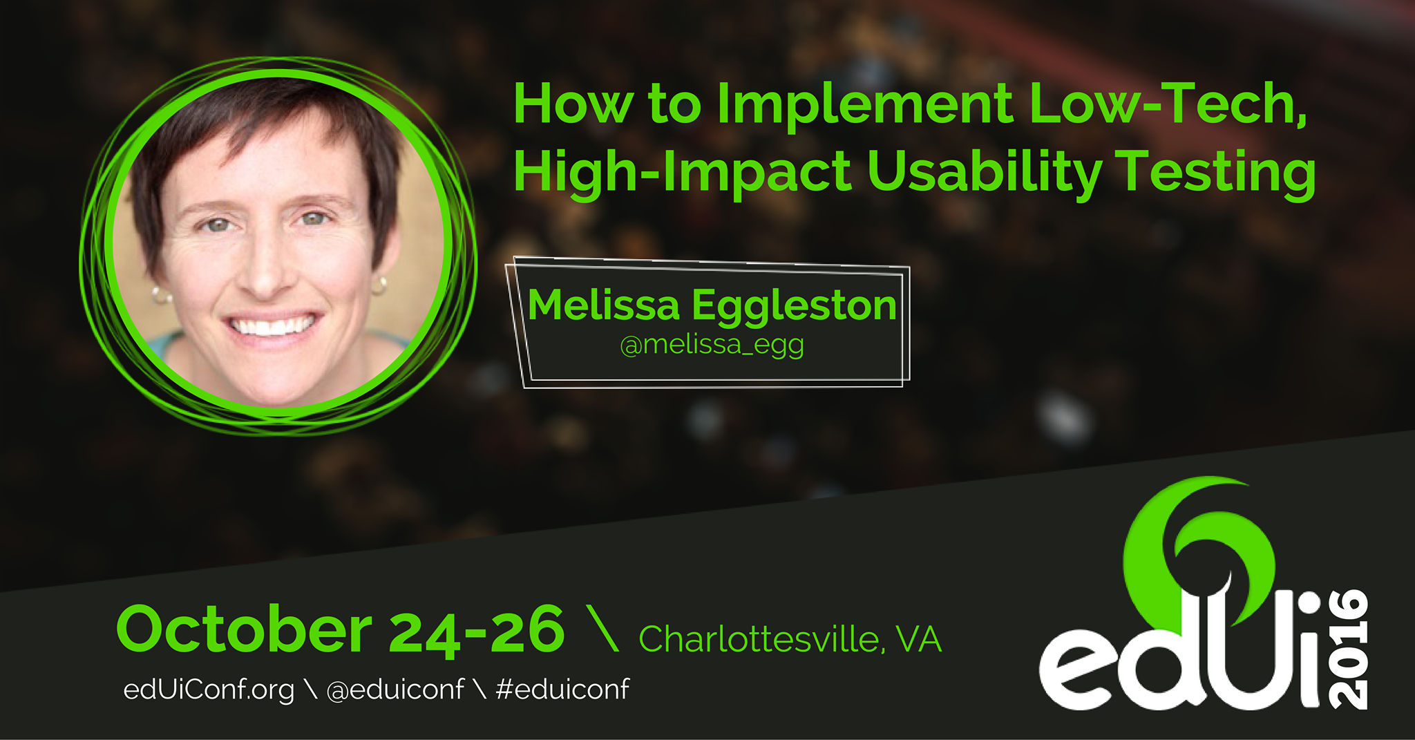
Steve Krug kindly plugged my usability workshop with Julie Grundy of Duke University. He then joined us as a helpful participant!
- Running with a keynote speaker is a unique experience. What a memorable jaunt planned by the conference organizers! It was worth getting out of bed early to hit the pavement with the inspiring Josh Clark. Wonder what the future of tech looks like? Watch Josh's fun talk Magical UX and the Internet of Things.
- Steve Krug first sparked my interest in UX in 2007. His fantastic book was required reading in grad school. If you are a person making choices about a website, read Don't Make Me Think! Your website visitors will thank you. At edUI, Steve gave a keynote speech. But he also participated in workshops, including mine, and made them better just by his quiet presence and helpfulness. He offers a great example to follow.
- Charlottesville, Virginia, is a walkable, fun and friendly location. How did I not realize this before?
- Aussie Donna Spencer rocked her workshop on moving from research to design. She wants us to write down a coherent story before jumping to content and functions. UXers, see Donna's detailed slide deck here.
- Getting fresh air between sessions = a better conference. Two thumbs up for having 3 interesting venues. How great not to feel stuck in a hotel with terrible carpet all day.
- You can hike to beautiful Humpback Rocks in the morning and still make an 11am session!
- Analytics master Mitch Daniels of the interaction agency Viget wants you to stop wasting your analytics budget. So stop tracking everything and focus on the KPIs for your organization. Learn from Mitch about analytics.
- The edUI organizers know how to put on a conference. They also made themselves very accessible throughout the event. If you work in the higher ed, library or museum field, attending edUI should be a high priority.
Learn more about the edUI conference here. Maybe I'll see you in Charlottesville next year!